IMHO, geographic accuracy is an all-or-nothing feature of a network diagram. If it doesn't help you decide between walking or riding, then it should optimise for riding.
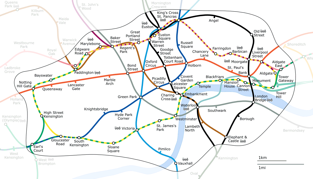
This map lacks Beck's clean, diagrammatic style without really adding much, in fact, unless you look very carefully, it seems not to include the fact that Mornington Crescent is on the Charing Cross Branch.
Beck's map works because it completely ignores the world above ground, and allows you to navigate the system at a glance.
That said, I have seen one advantage to this map. Platform Compass directions. For example:
Stations on the Piccadilly Line, from Turnpike Lane to Cockfosters have East- and Westbound platforms. This doesn't make sense when read in conjunction with Beck's map, which draws that as a vertical line, which most people would interpret as North/South. On this map, you can easily see that East means towards, and West, away from Central London.
On the very local scale, this map seems to work (the relationship between Leicester Square and its 4 neighbouring stations looks about right).
On a larger scale, it doesn't seem to work. I looked at a few journeys I regularly take on foot: two @ 1 mile, one being about twice as far as the other on the map. Another two @ 2.5 and 3 miles, which were 4 and 5 times the distance of the shorter mile, respectively.
Just visited London for vacation a few weeks ago. As a non-Londoner, I have to say that I like the new version much better. I can already see several mistakes that I made when choosing which routes to take-- mistakes that I doubt I would have made had I had access to this map. Bravo.
In Zone 1, the stops are so frequent that the number of stops is normally far more significant than the distance between them; and in the outer zones, you rarely have a choice anyway.
Mostly it has to do with where things are in reality on the surface rather than taking wrong routes. You can look at a map of London and try to correlate the stations on that map with the "official" non-geographical version, or you can have a map of London and a map of the tube system that's fairly close to it. Just going off the Thames alone makes it easier to figure out where the best place to get off is.
There's a similar geographically accurate map on wikimedia, but without the simplifications, such as making the section of the circle/district line through from Notting Hill Gate to Edgware Road straight. Removing some of the curves and the other changes, while relatively small, really makes the map easier to read.
http://upload.wikimedia.org/wikipedia/commons/0/08/London_Un...
This map might make it easier to see how the tube reflects the geography, and so conjure a better image of London, but it makes using the tube system much harder.
As case in point, the fork in the Northern line at Kennington is much harder to comprehend and the number of tourists who get bewildered by this feature on the current map is large enough as it is.
It also still misrepresents a lot of the distances between stations, (Old St to Farringdon is a long way, much further than Old St or Moorgate to Liverpool St). If you are going for a concept of geographical correctness it has to be very exact or a complete abstraction.
Another odd thing about this effort, is that it solves a problem that doesn't exist any more.
The TFL Journey planner will take you from anywhere in London to anywhere else in London using the most appropriate route; Google directions include both public transport and pedestrianism; GPS is on a lot of people's phones; and Legible London fixes the problem for the technophobic.
This map lacks Beck's clean, diagrammatic style without really adding much, in fact, unless you look very carefully, it seems not to include the fact that Mornington Crescent is on the Charing Cross Branch.
Beck's map works because it completely ignores the world above ground, and allows you to navigate the system at a glance.
That said, I have seen one advantage to this map. Platform Compass directions. For example:
Stations on the Piccadilly Line, from Turnpike Lane to Cockfosters have East- and Westbound platforms. This doesn't make sense when read in conjunction with Beck's map, which draws that as a vertical line, which most people would interpret as North/South. On this map, you can easily see that East means towards, and West, away from Central London.